Connecting rescue animals to more foster homes
Project Timeline
2 Days
Platform
Web – Case Study
Role
UX/UI Designer
Intro
A nonprofit tech company that empowers animal rescues to connect with each other, fosters, and other rescue advocates in order to move animals from overcrowded, high-kill areas to places where they’re more likely to be adopted.
Problem
Improve site navigation to increase the number of animals matched to a foster.
Process
The section takes a deep dive into understanding the user (John) by forming user stories, conducting usability testing, and understanding the website’s current navigation.
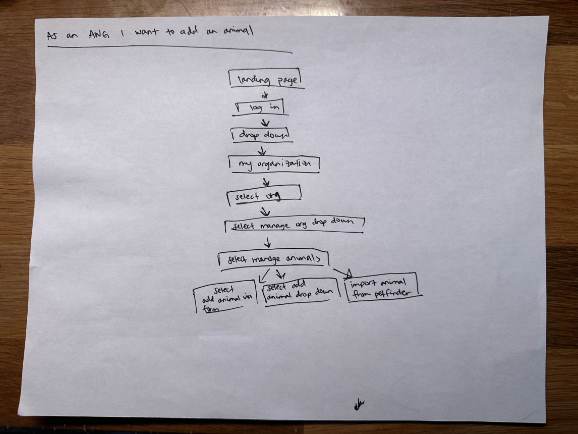
Understanding the Information Architecture
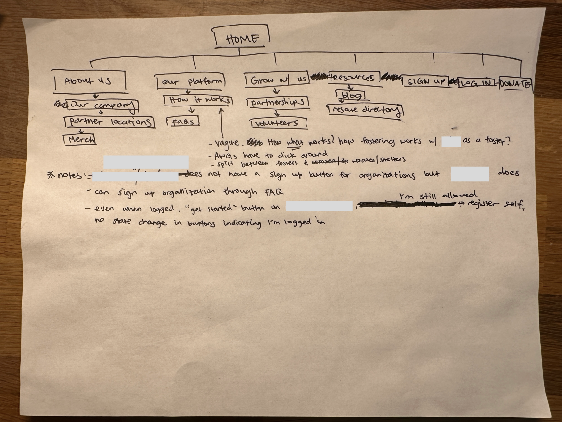
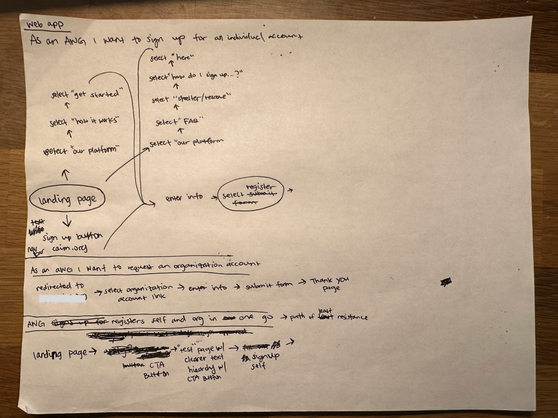
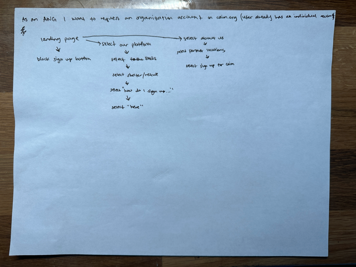
Understanding the different paths users currently take to complete user tasks
Understanding the User

The Animal Lover
“I need to find fosters through the website so that I can make room to shelter more animals.
John’s priorities are:
-Get as many fosters matched to his animals.
John’s current pain points:
- Create an account
- Manage animals
- Manage foster applications
John’s journey
- John adds more animals to his shelter
- Learns about
- Browses website
- Books a call
- Is guided through organization registration
- Adds animals via Petfinder
- Receive foster application via email(?)
- View foster application
- Approve application
- Initiate the fostering process with the applicant
- Animal is transferred to a foster home
User Stories
User stories helped to understand context, motivations, and the desired outcome:
- When browsing, I want to locate where I can sign up so I can start using their services to foster my animals
- When I have an account, I want to add animals so my animals can quickly get matched to a foster
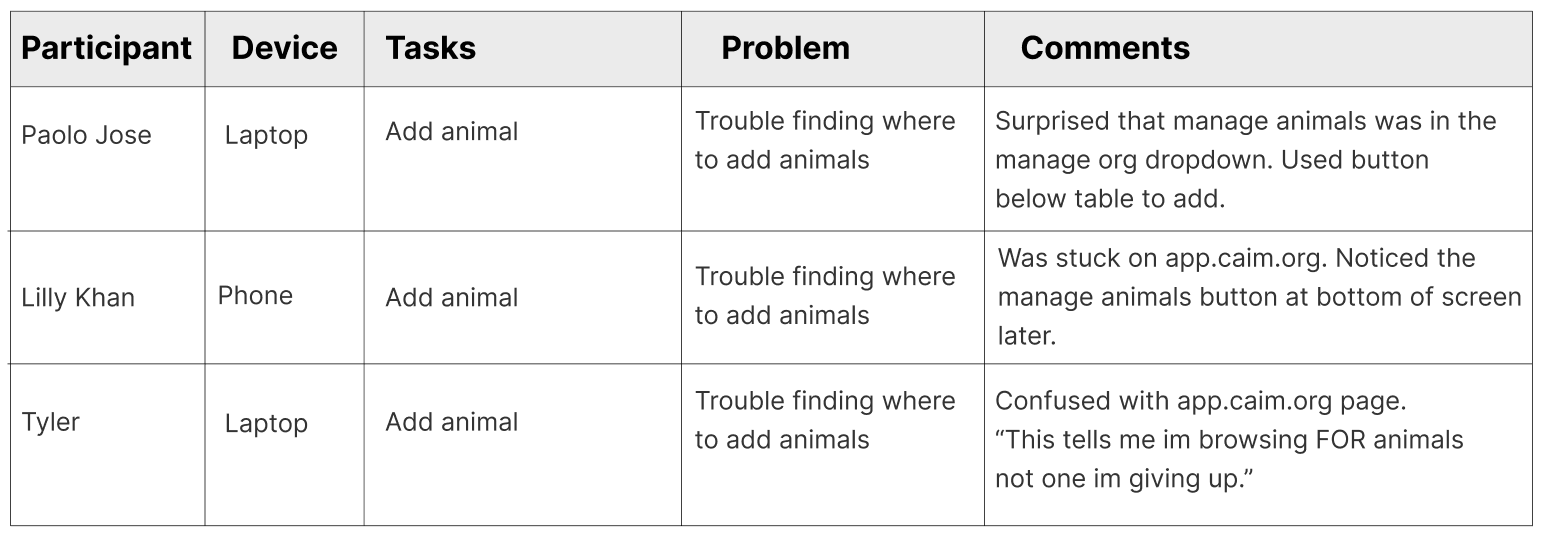
Find navigation friction through usability testing
Task: How would you sign up your organization?

Task: How would you add an animal your organization has rescued/is sheltering?
Prioritizing fixes based on usability testing, stating assumptions, constraints, and trade-offs.
- Manage animals: All participants had trouble finding where to add animals
- Create an account: 2/3 of the participants had difficulty finding where to sign up
Assumptions:
- John is using the platform for the first time.
- John will not book a call to be guided through sign-up.
- John will upload animals immediately after submitting his organization form.
- John only has one organization to submit.
- John is not fostering any animals.
Constraints were introduced:
1. Work within the website’s current navigation.
Trade-offs were introduced to focus on John achieving his goals:
- Usability above aesthetic
- Use existing components/patterns already found within the platform.
Brainstorm

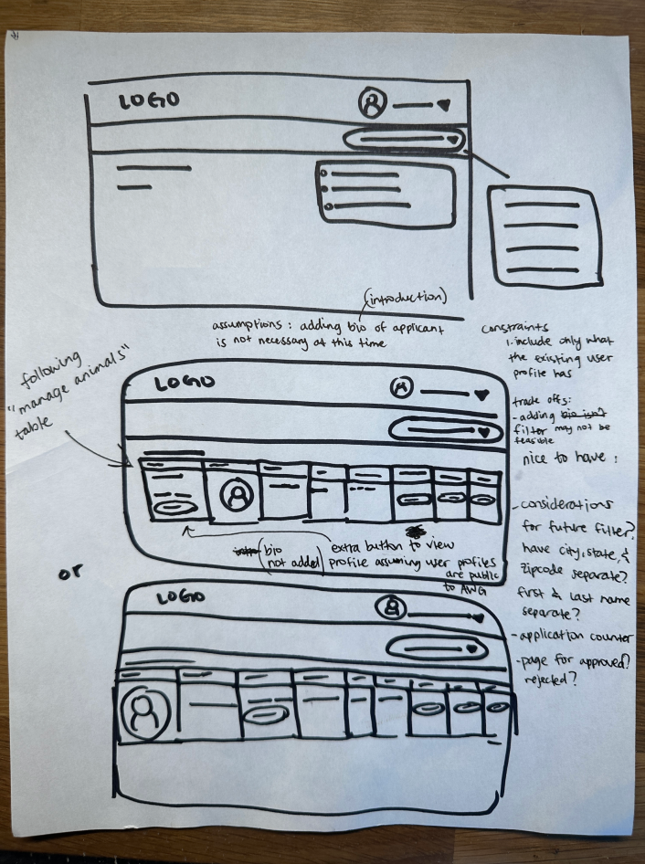
applications
Suggested edits
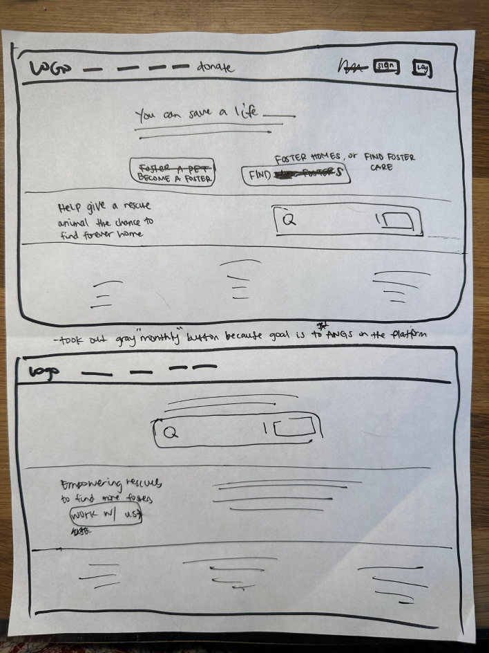
- Prioritizing increasing the # of animals that are matched to a foster”:
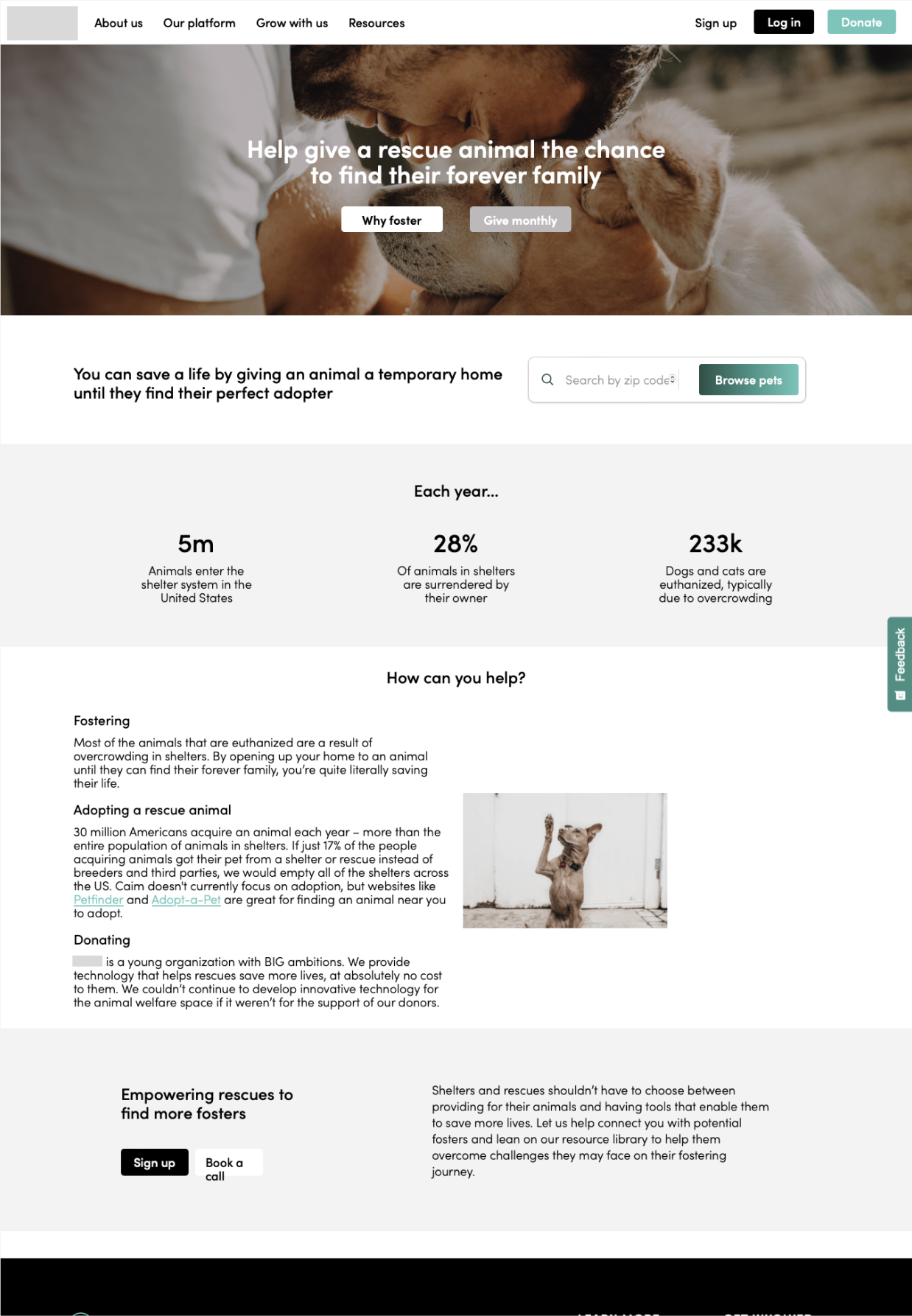
-Clearer language for CTA buttons: “become a foster” and “get foster” in order to entice fosters and AWGs to take action (sign up).
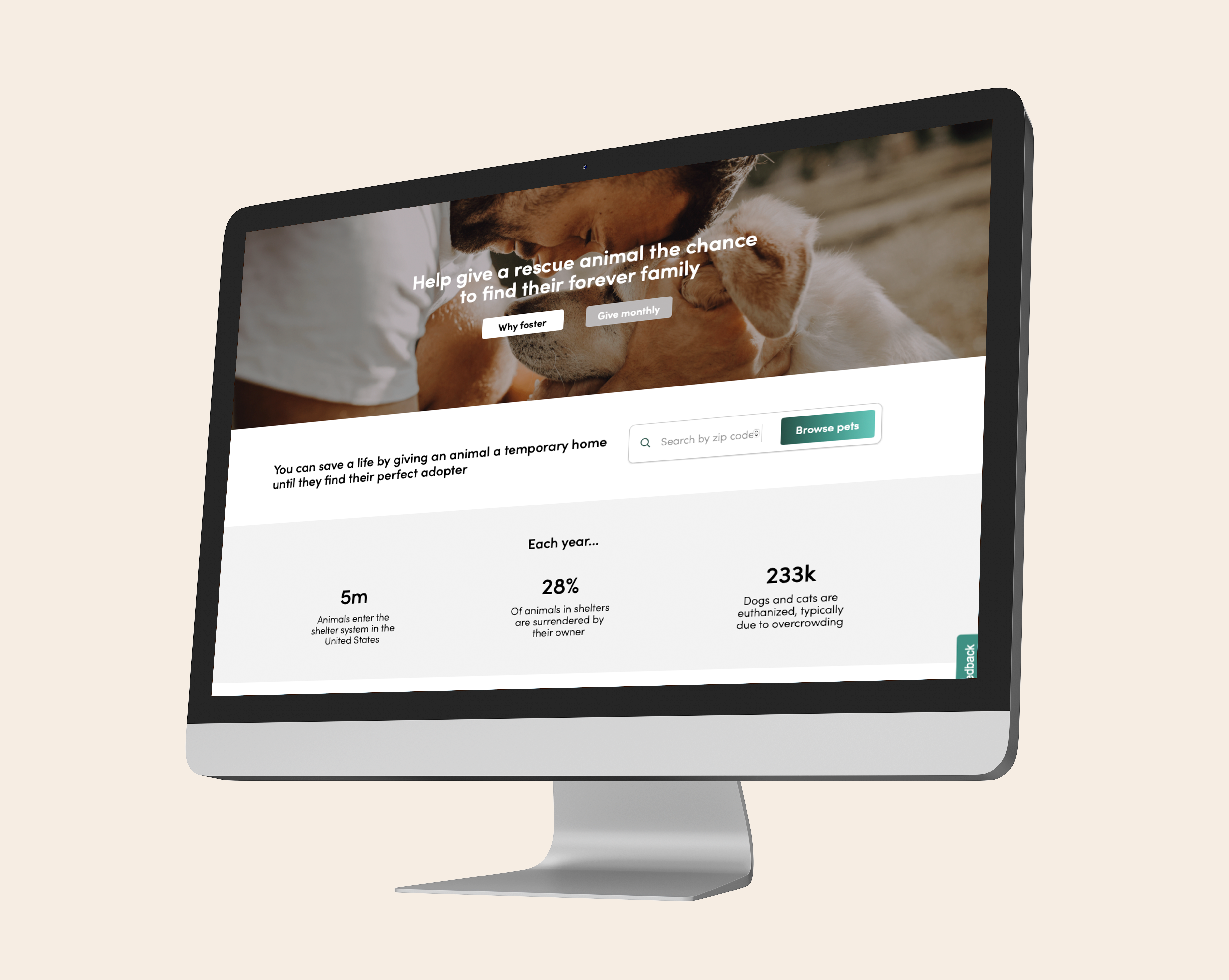
-Placed above the fold, buttons are larger
-In order for animals to get matched, a solution is needed to solve AWG pain points of creating an account. -> Testing showed when not guided, users had SOME difficulty finding where to sign up as an AWG. - Moved to 4th row:
-Segway into “how can you help” row, since there’s a “Donate”
button in the nav bar and in the footer”, and all 3 direct to
same page.
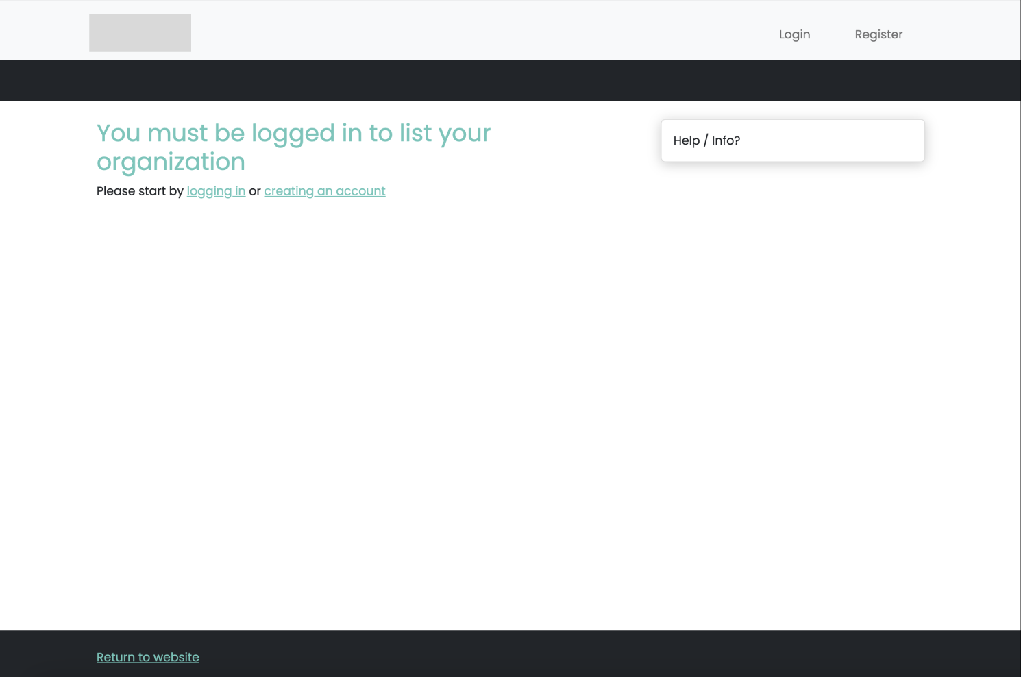
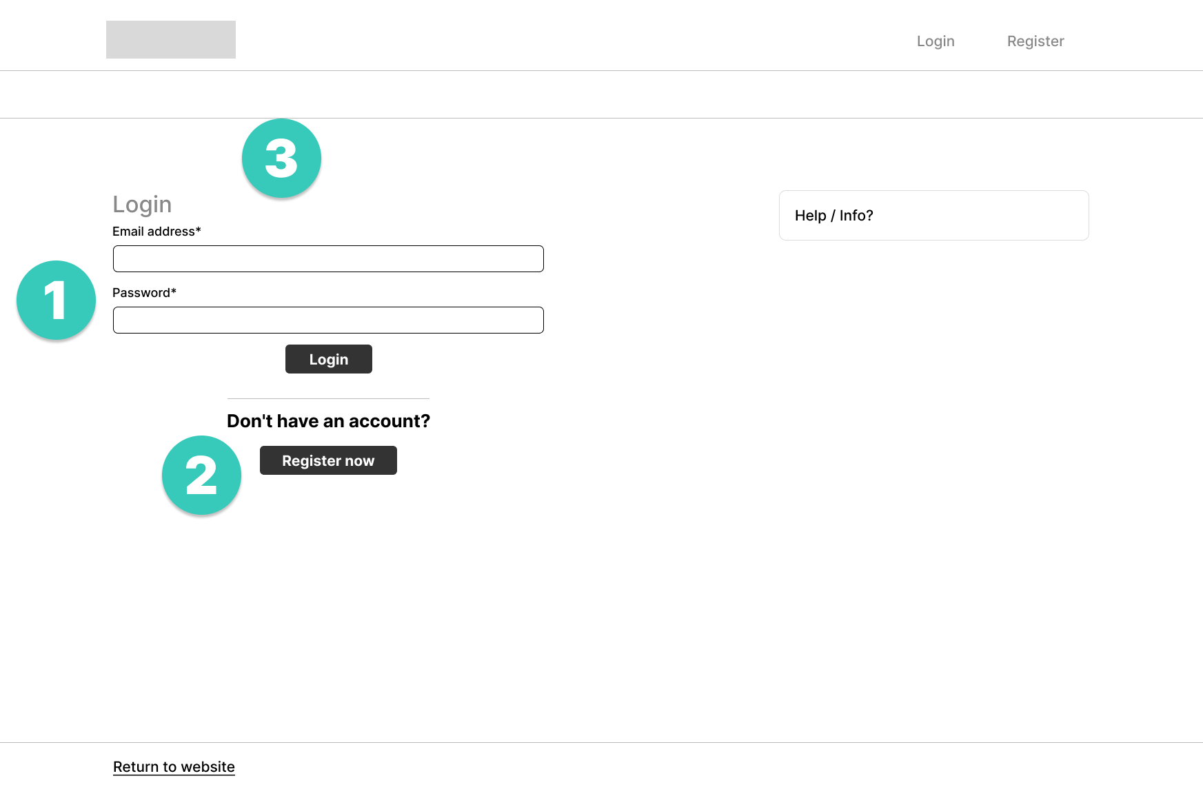
- Show login:
When AWGs land on “redacted”, they are greeted by “You must be logged in to list your organization” and instructed to log in to create an account. To reduce clicks they are now shown a similar version of the login page. - CTA button to register self:
“Create an account” text link is replaced with a CTA button to encourage users to create an account.
“I feel like I got lost on the way . It much felt like it was designed for people looking for dogs. Not for posting dogs.”
- Hierarchy:
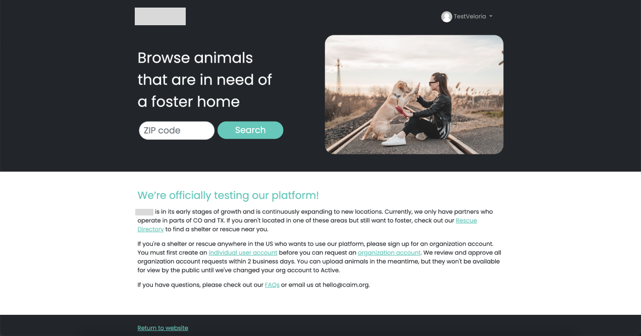
-I decided to break up the wall of text according to two different users.
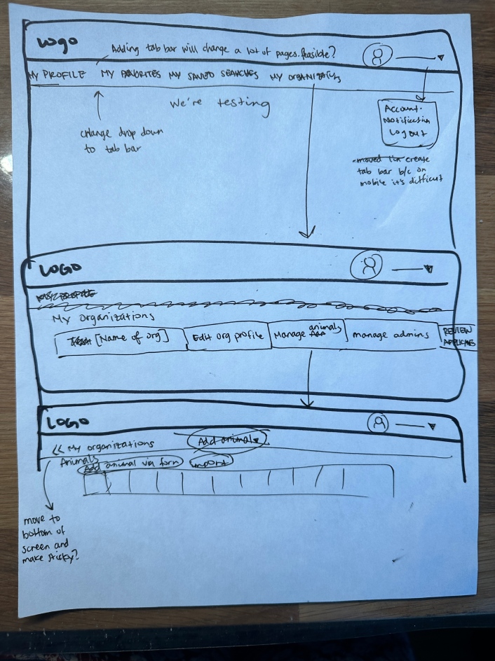
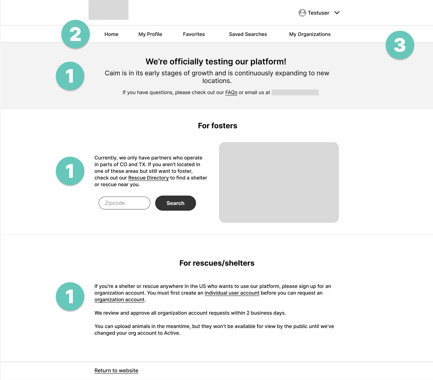
-Test platform message was moved up as this is an announcement that needs to be seen right away by users. - Show AWGs where to find their organizations = Tab bar:
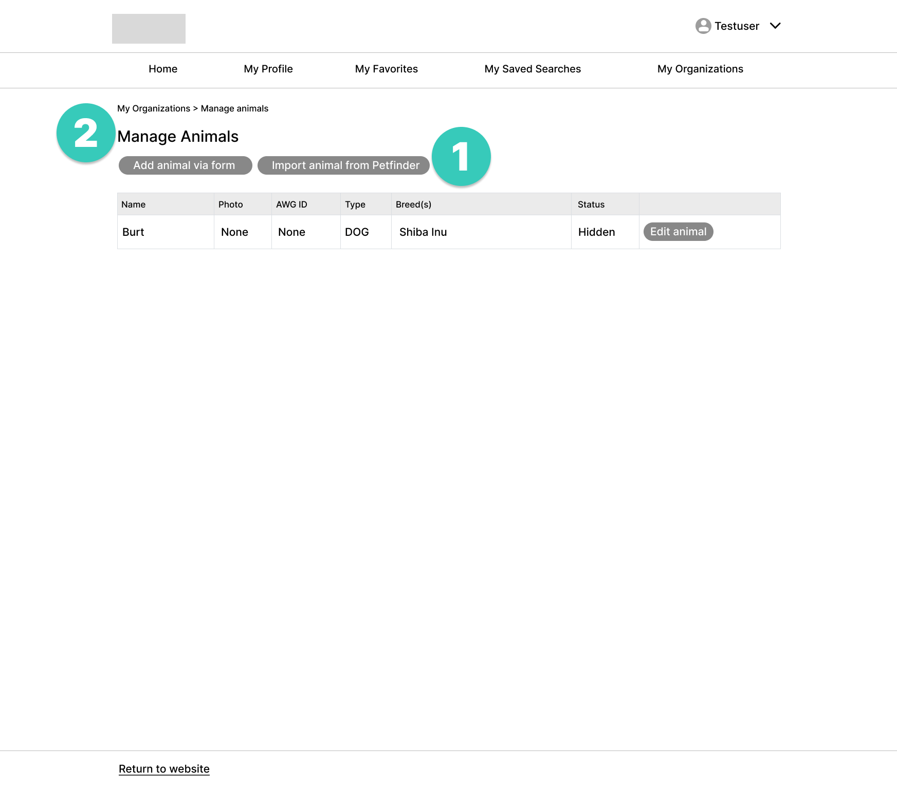
AWGs need to upload animals and check foster applications. Usability testing shows that they had difficulty finding where to do anything related to their organization, tucked in a drop-down menu. This could be due to the gray color of drop-down menu. - Addressing confusion:
Removed black background due to inconsistencies in live version and largely because it drew attention to browse animals. This resulted in confusion during usability testing to do AWG related tasks.
“I had to go real deep to add animals”
- “I had to go real deep to add animals”:
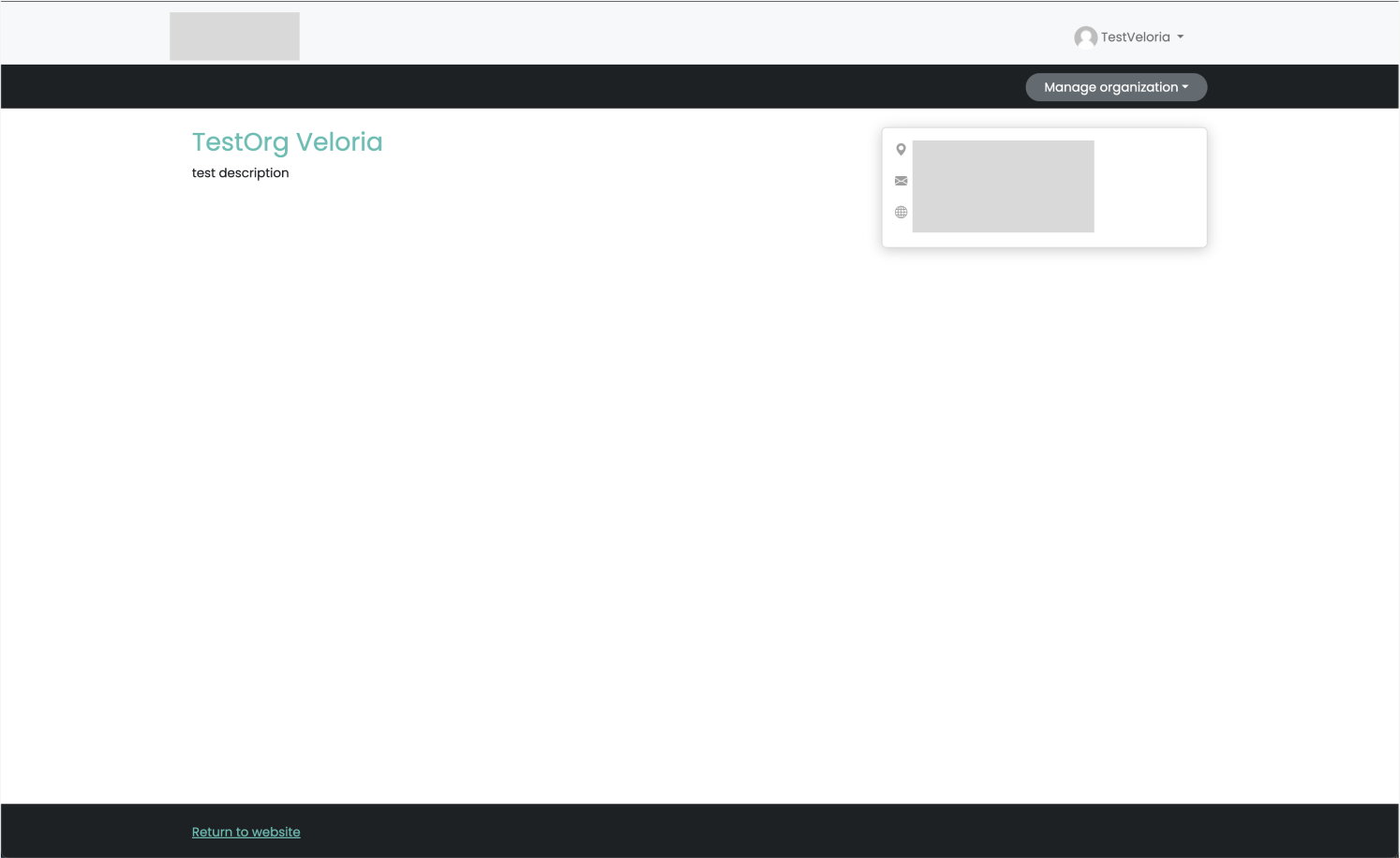
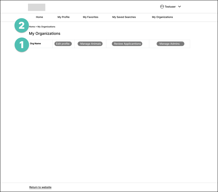
Used a similar table layout that’s seen often in this space. At first glance, you can see what AWGs can do within “my organizations” instead of clicking a newly appeared drop-down menu (manage organization). - Breadcrumb navigation:
New tab bar will not be visible on mobile however secondary navigation aid that improves customer experience by helping users understand their location on a website.

- “I had to go real deep to add animals”:
Moved “add animal via form” and “import animal Petfinder” button above table for more visibility. “Add animal” drop-down is less visible on mobile, this could be due to the dark gray color that may look inactive to some users. - Consistency:
Changed “Animals” text to “Manage Animals” for consistency
Retrospective
Usability testing of the website’s current navigation showed confusion on where to sign up as a shelter or rescue. The current website prioritized the “Donate” button and “Why Foster” buttons above the fold. The main goal is to increase the number of shelters and rescues to sign up through the website and thus the suggestion to move the “sign up” button above the fold ensures that those who are looking to match their animals suggest a likelihood of the user to register more with ease. Due to time constraints, I would like to do A/B testing to see which design would increase conversion rates. I would also like to do tree testing to further confirm.